Brand Identity
Packaging Design
3D Visualization
Art Direction
client
challenge
solution
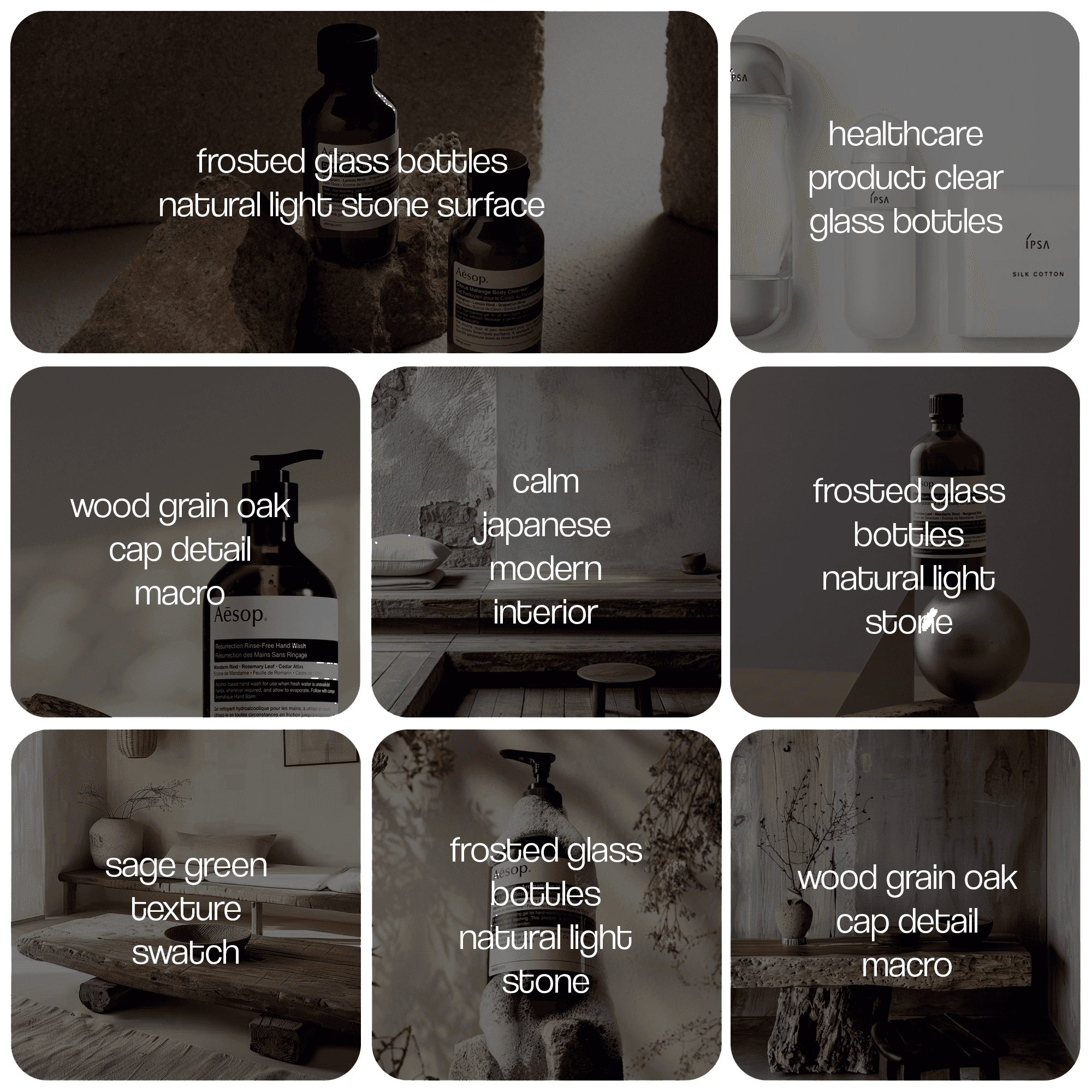
We started by studying the intersection of Japanese aesthetics and Western skincare expectations. The moodboard drew from wabi-sabi philosophy, finding beauty in simplicity and imperfection. Key references: natural textures (stone, wood, linen), soft morning light, and the quiet confidence of brands like Aesop and Tatcha. The goal was clear: premium without pretension.
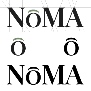
The wordmark needed to carry the entire brand. We explored serif, sans-serif, and hybrid approaches before landing on a refined serif with one distinctive detail : the macron on the O. This single diacritical mark anchors the Japanese identity without being literal. Several directions were tested, geometric, calligraphic, ultra-minimal, before arriving at the final version that balances elegance with readability at small sizes.
The palette is deliberately restrained: warm neutrals (cream, sand) as the foundation, sage green as the signature accent, and charcoal for contrast. A gold touch adds a subtle premium layer without tipping into luxury territory. Typography follows the same less-is-more logic : an elegant serif for headlines paired with a clean geometric sans-serif for body text. Generous whitespace is treated as a design element, not empty space.
Title playfair display, 48px
Body outfit, 24px
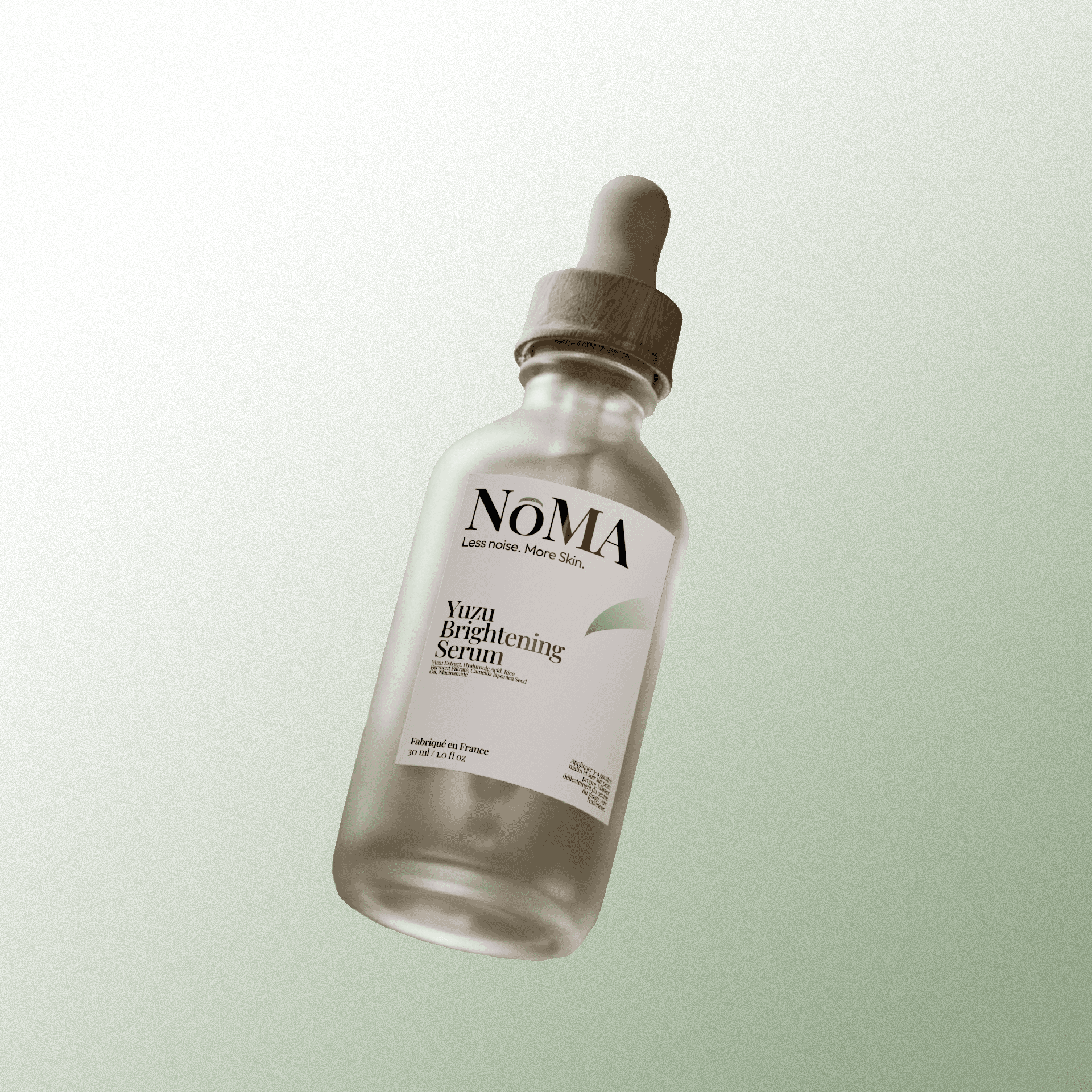
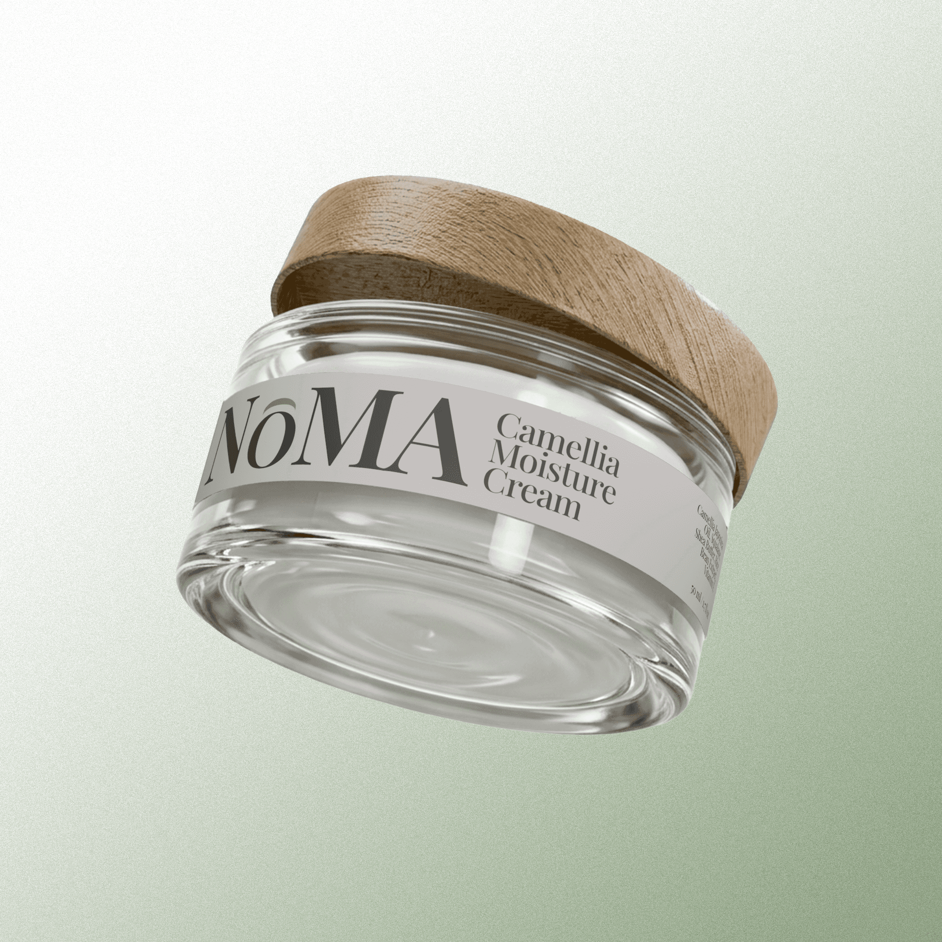
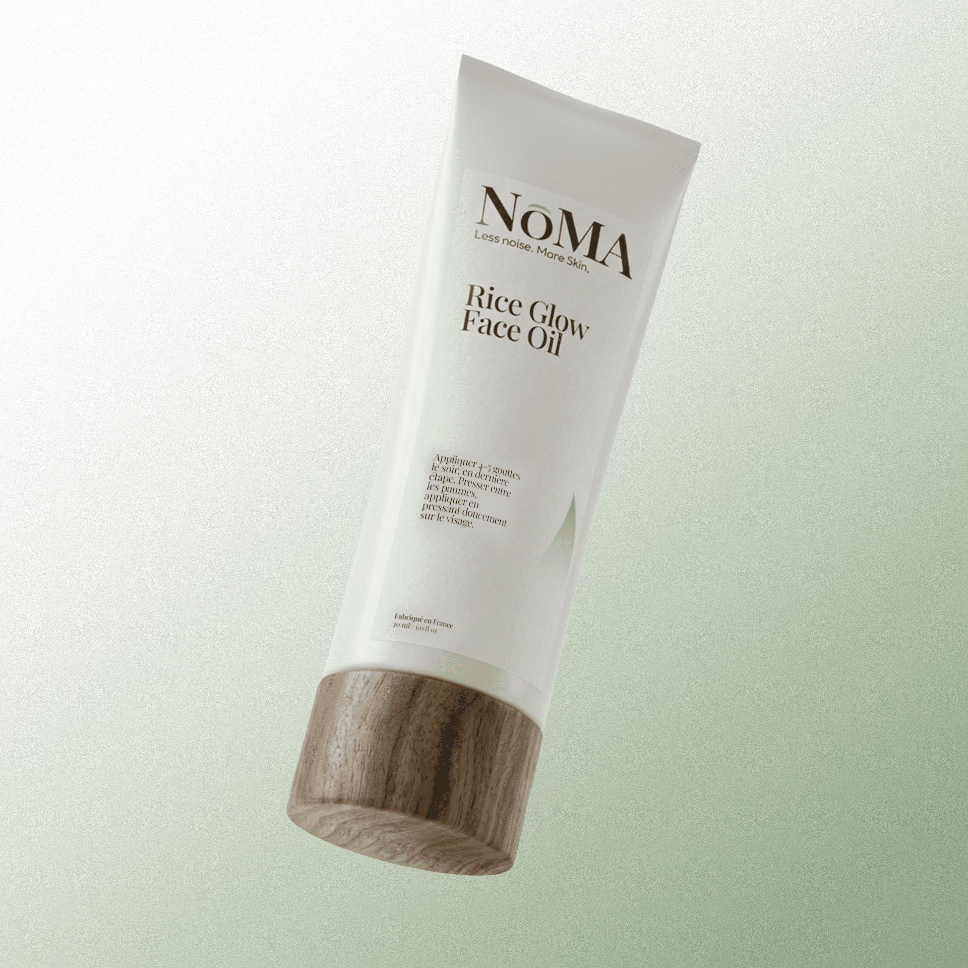
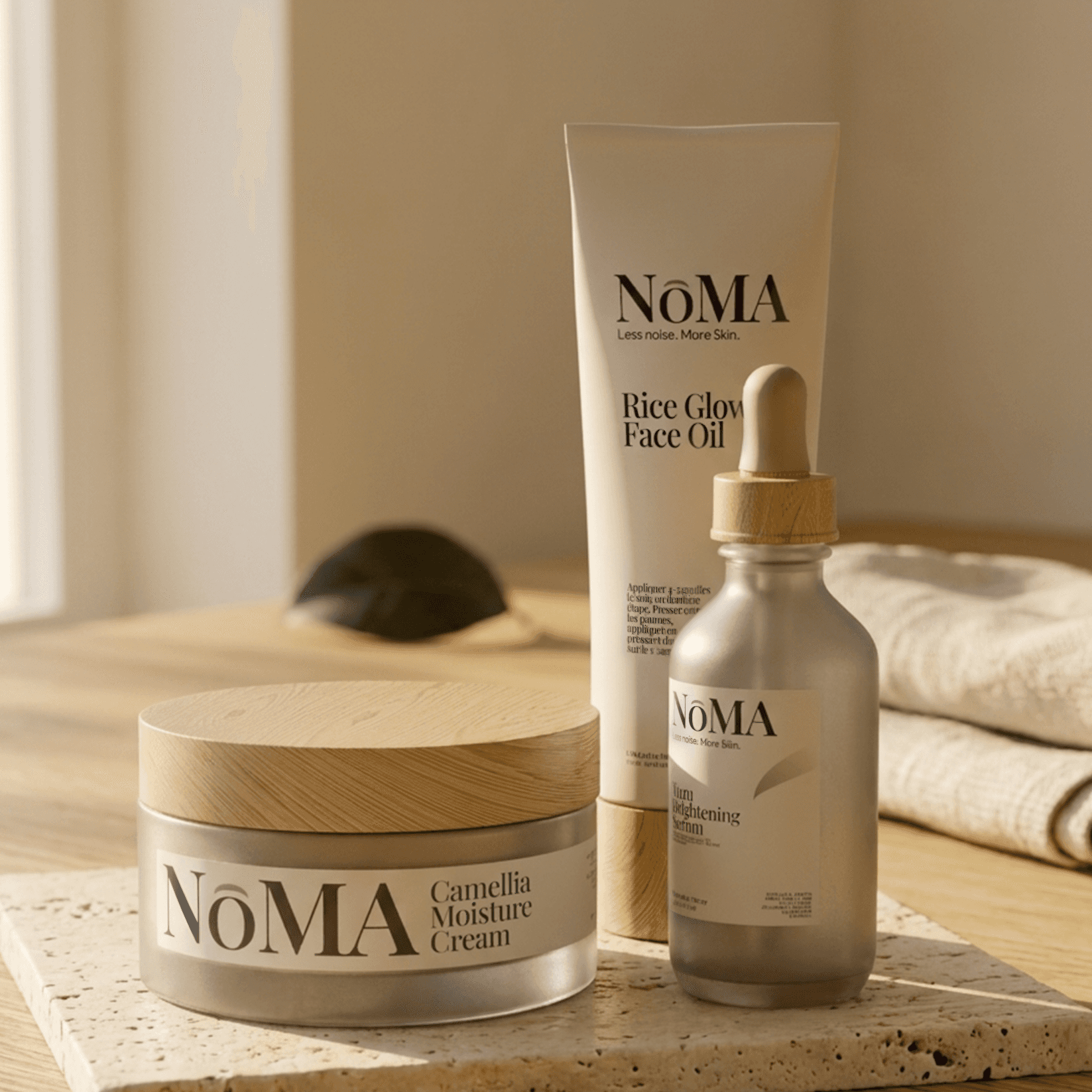
Each of the three products was modeled and rendered in Blender 3D. The packaging concept centers on frosted glass vessels with natural wood caps, materials that feel tactile and honest. The labels are intentionally minimal: the NOMA wordmark, product name, and key ingredients. Nothing more. Every detail was controlled : the translucency of the glass, the grain of the wood, the exact placement of light and shadow. The result is packaging you'd want to display, not hide under the sink.
3
12
3
NOMA launched with a brand identity that positions it as a credible player in the premium skincare space from day one. The 3D packaging renders eliminated the need for costly physical prototyping, while the complete visual system ensures consistency as the brand scales across e-commerce, social media, and retail channels.
" transform="translate(3 16)" width="19px"/><path d="M 0 0 L 19 0" fill="transparent" height="1px" id="Ykt8NFX87" stroke-dasharray="0" stroke-linecap="round" stroke-linejoin="miter" stroke-miterlimit="4" stroke-width="2" stroke="rgb(0, 0, 0)" transform="translate(3 10)" width="19px"/><path d="M 0 0 L 19 0" fill="transparent" height="1px" id="cYARcyabk" stroke-dasharray="0" stroke-linecap="round" stroke-linejoin="miter" stroke-miterlimit="4" stroke-width="2" stroke="rgb(0, 0, 0)" transform="translate(3 4)" width="19px"/></svg>)