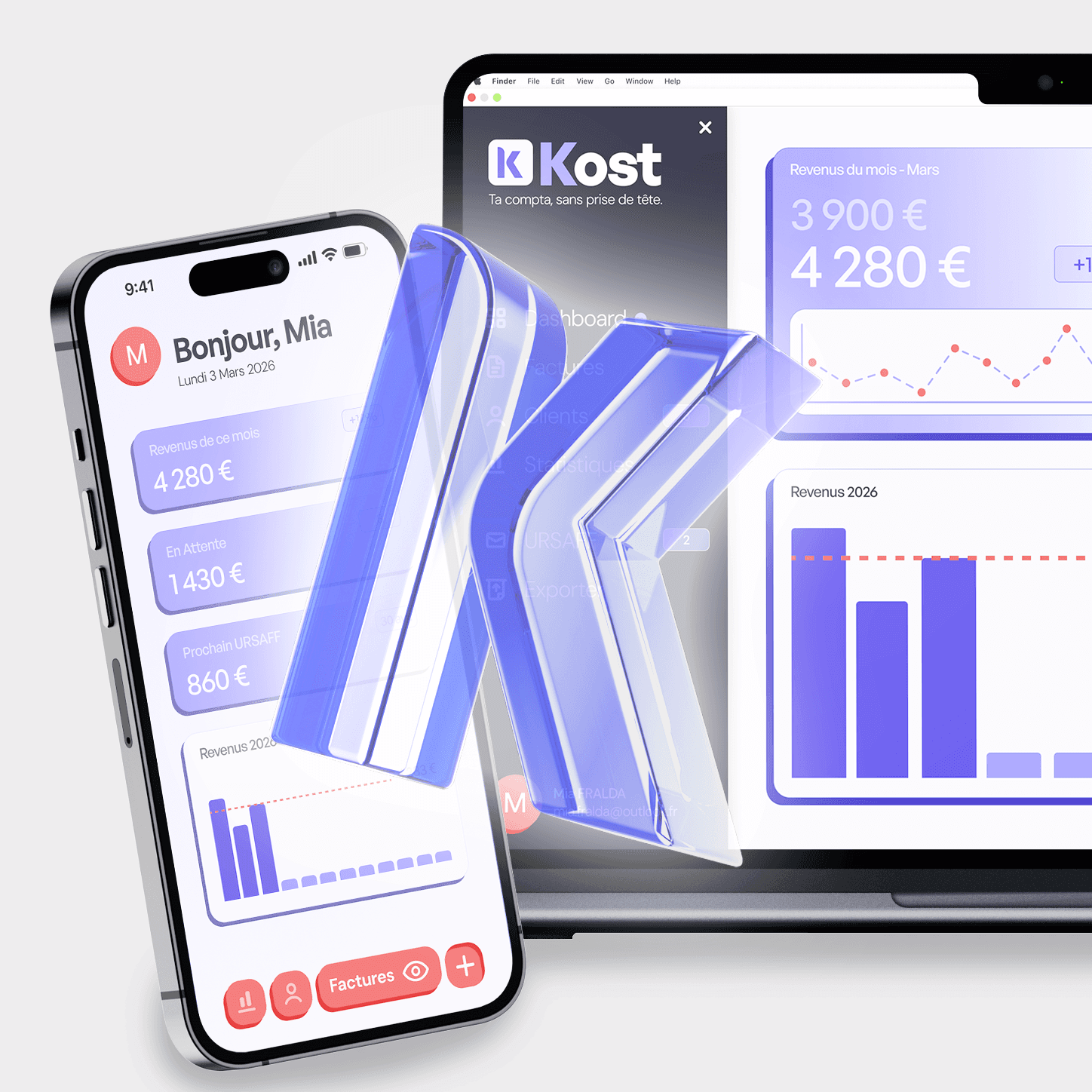
Brand Identity
UI Design
Landing Page
Product Design
client
challenge
solution
We started by mapping the landscape of freelance finance tools, what they do well, and where they consistently fail. The pattern was clear : trustworthy but cold, functional but ugly. Kost's positioning emerged from that gap: the Notion of accounting. A tool powerful enough to replace spreadsheets, beautiful enough to open every morning without dread. Key references: modern SaaS products (Linear, Notion, Stripe), with a color direction rooted in deep indigo focused, premium, creative.
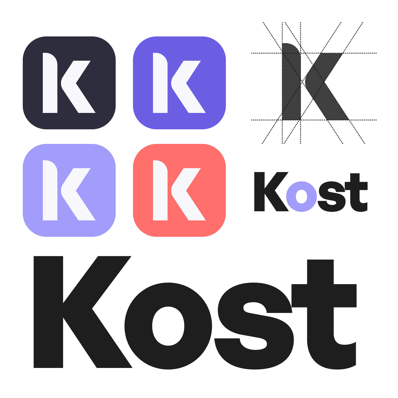
The wordmark needed to feel modern and international, something a Paris-based designer and a Lyon-based developer would both find credible. We explored geometric, minimal, and hybrid approaches before landing on a clean sans-serif. The same logic as the brand name, simple, considered, slightly unexpected. The K letterform was tested across 20 color and background combinations to validate contrast and accessibility across every product surface.
The palette is built around a tension between depth and lightness. Deep indigo anchors the system, serious, focused, trustworthy. Lavender softens it. Coral activates it, used exclusively for CTAs, alerts, and key actions. The dark Nuit background powers the dashboard environment, while Brume keeps marketing surfaces clean and airy. Typography follows the same logic : a geometric sans-serif for headings carries the modern SaaS confidence, while a humanist sans for body copy keeps data-heavy screens readable and human.
Title general sans, medium 48px
Body dm sans, medium, 36px

UI Design
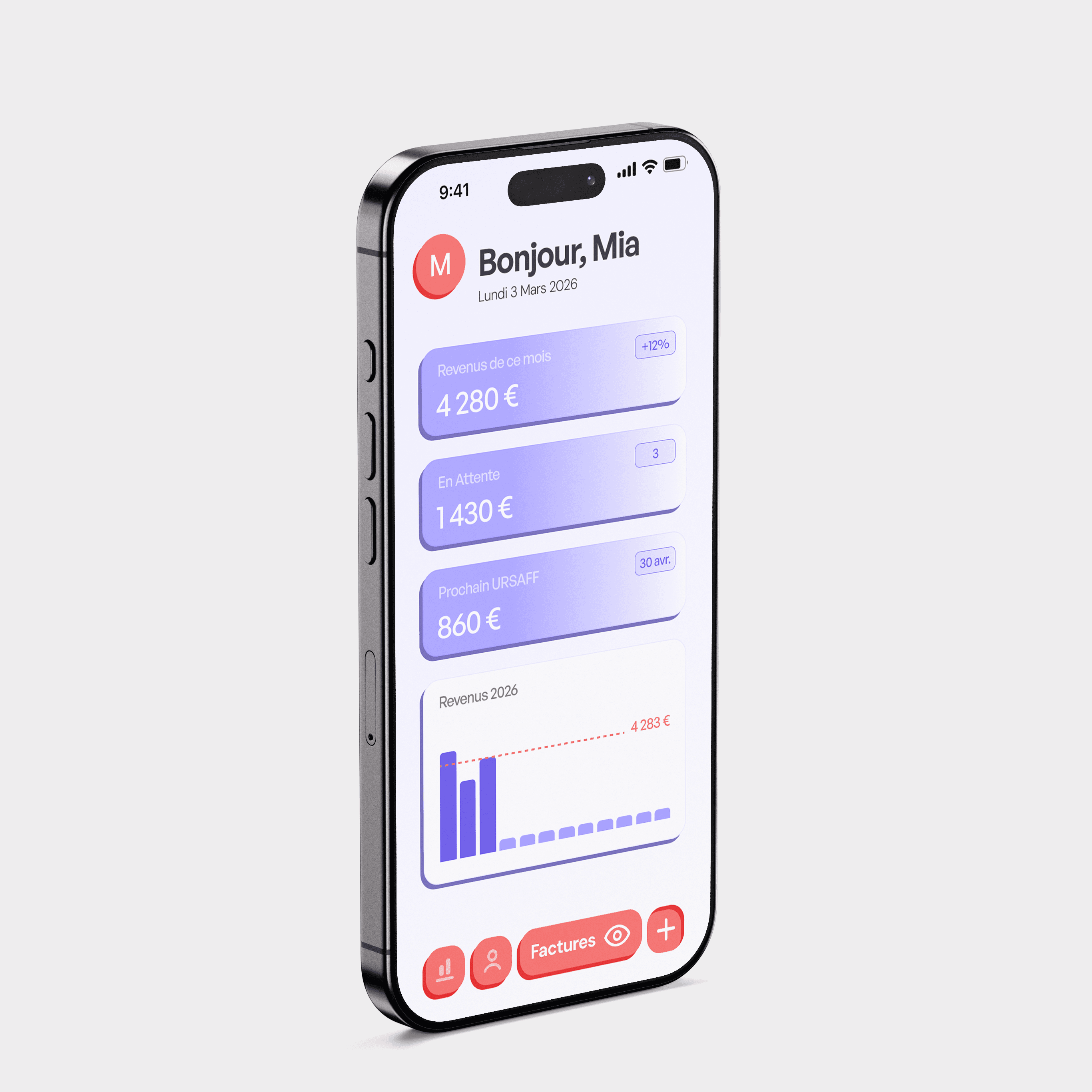
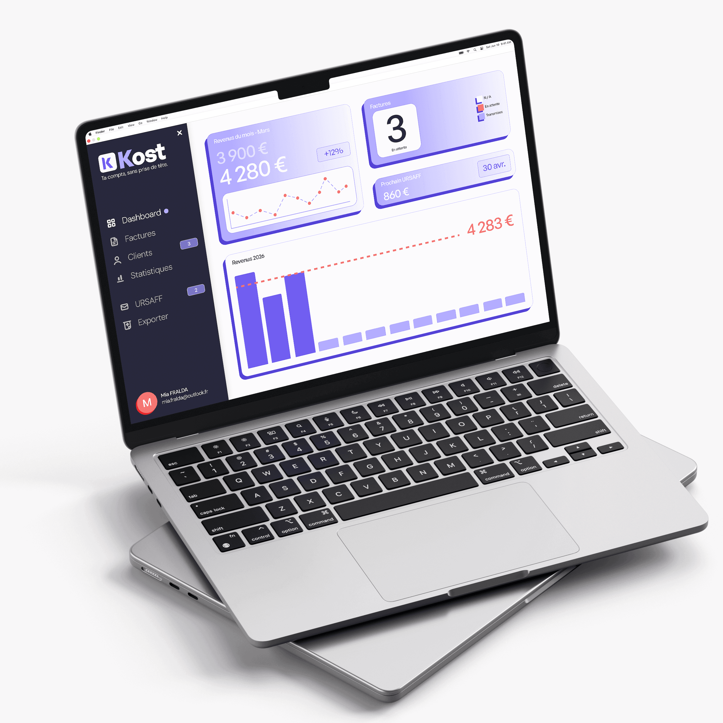
Three screens were designed to demonstrate the full product experience,one desktop, two mobile. The desktop dashboard uses a dark sidebar to anchor navigation, with a light main area for data clarity. Stat cards surface the three numbers a French freelancer checks most: monthly revenue, pending invoices, and upcoming URSSAF contribution. A 2026 revenue chart with a coral dotted target line turns financial tracking into something visual and motivating. On mobile, the same information adapts for thumb navigation, stacked stats, a condensed chart, and a bottom nav bar built for one-handed use. The new invoice flow reduces friction to its minimum : client, service, amount, generate.
4
20
3
Kost launched with a brand and product design system that could credibly compete with funded SaaS tools on day one. The complete UI kit, four screens across two breakpoints, gives any development team a clear, documented starting point. The brand system ensures consistency as Kost scales from landing page to full product, from free tier to premium.
" transform="translate(3 16)" width="19px"/><path d="M 0 0 L 19 0" fill="transparent" height="1px" id="Ykt8NFX87" stroke-dasharray="0" stroke-linecap="round" stroke-linejoin="miter" stroke-miterlimit="4" stroke-width="2" stroke="rgb(0, 0, 0)" transform="translate(3 10)" width="19px"/><path d="M 0 0 L 19 0" fill="transparent" height="1px" id="cYARcyabk" stroke-dasharray="0" stroke-linecap="round" stroke-linejoin="miter" stroke-miterlimit="4" stroke-width="2" stroke="rgb(0, 0, 0)" transform="translate(3 4)" width="19px"/></svg>)